If you’ve ever dipped your brush into acrylics and wondered how to get that perfect autumn shade, you’re not alone! Acrylic color mixing can feel intimidating, but once you understand a few color theory basics and try some cozy seasonal combos, you’ll be mixing colors like a pro in no time. 🎨✨
In this guide, you’ll learn:
- 🎨 3 easy fall color combos
- 🌈 Color theory made simple
- 🍁 Fun fall painting ideas (including how to paint with actual leaves!)
- 🛒 Where to find quality paints that won’t break the bank
🍁 Why Acrylic Color Mixing Matters
Color is magic in painting — it sets the mood, creates depth, and brings your art to life.
But acrylic color mixing doesn’t have to be guesswork. By learning how colors interact, you’ll save paint, time, and frustration!
🎨 Fall-Inspired Acrylic Color Combos
Autumn is all about cozy, warm hues. Try these dreamy combos in your next painting:
🍊 Combo 1: Cadmium Red + Cadmium Yellow = Warm Pumpkin Orange
→ Great for pumpkins, fall leaves, or sunset skies.
🍂 Combo 2: Burnt Sienna + Cadmium Yellow = Golden Brown
→ Use for tree trunks, cozy knitwear, or textured backgrounds.
🍇 Combo 3: Alizarin Crimson + Ultramarine Blue = Deep Plum
→ Stunning for shadows, berries, or dramatic skies.
📌 Tip: Mix small amounts and swatch on scrap paper before committing to a canvas.
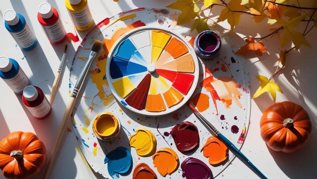
🌈 Simple Color Theory for Acrylic Artists
No need for complicated wheels—here’s what you really need to know:
✅ Primary Colors: Red, Yellow, Blue (you can’t mix these; they’re the base for all others)
✅ Secondary Colors:
- Red + Yellow = Orange
- Yellow + Blue = Green
- Red + Blue = Purple
✅ Tertiary Colors: A mix of a primary and a secondary — like yellow-orange or blue-green.
🔥 Warm Colors: Red, Orange, Yellow – they feel energetic.
❄️ Cool Colors: Blue, Green, Purple – they’re calm and peaceful.
💡 Mixing tip: Add dark colors into light ones slowly—it’s much easier to control shade that way!
Need More Help?
Check out my earlier post: How to Mix Acrylic Colors for step-by-step techniques on blending, layering, and more!
🍁 Try Organic Stamping with Fall Leaves (a.k.a. “Botanical Impressions”)
One of the most magical ways to bring autumn into your artwork is by using real fall leaves to create “botanical impressions” — a more refined twist on traditional leaf stamping.
This technique isn’t just fun — it can actually add texture, depth, and natural elegance to your acrylic paintings.
Here are some creative ways to use it:
🎨 Abstract Backgrounds
Use the leaves to create layered textures that give your canvas a dreamy, earthy base. Think burnt oranges, deep burgundies, and muted greens stamped into a soft ombré background.
✨ Accent Textures Under a Painting
Before painting your main subject (like a fall tree or pumpkin), create a leafy texture underneath with subtle tones. This adds dimension and gives your artwork a unique, one-of-a-kind feel.
🍂 Minimalist or Nature-Inspired Art
If your style leans toward clean lines and neutral tones, try pressing one or two leaf prints on a plain canvas and adding a handwritten quote or brushstroke detail. It’s a simple and chic decor piece — perfect for cozy fall vibes.
💡 Pro tip:
For a touch of elegance, lightly paint the edges of your leaf with metallic gold or copper before pressing. The result? An elevated, luxe texture that glows beautifully in the autumn light.
🎨 Mix it Up:
Combine this technique with brush strokes or stenciling for a mixed-media piece. Use contrasting colors (like navy + rust, or olive + cream) to create visual interest. It’s also a great way to experiment if you’re new to acrylics but want something unique and personal.
🤓 Did You Know? Fun Fall Painting Facts
🍁 The colors in autumn leaves come from pigments like carotenoids and anthocyanins — the same ones used in some paints! Nature is basically a walking palette.
🎨 The word “palette” originally meant a small wooden board used for mixing paint, but it comes from the Latin pala, meaning “spade” or “blade.”
🖌️ Van Gogh loved fall colors — rich oranges and earthy browns dominate his later works.
🛒 Where to Buy Great Acrylic Paints
Good paint makes a difference — it mixes better, covers smoother, and lasts longer.
For top-rated brands like Liquitex, Winsor & Newton, or Golden (including beginner sets), check out Blick Art Materials 🎨🛍️
🚀 Final Thoughts
Acrylic color mixing isn’t just a skill — it’s a creative adventure! With cozy fall combos, simple color theory, and playful techniques like leaf printing, you’re set to create art that celebrates the best of autumn.
So grab your brushes, collect some leaves, and remember: every “mistake” is just a new color discovery waiting to happen. 🍁